Paperlane is a premium print studio built for brands and creators who care deeply about craft. When they came to us, they had a clear goal: to translate their dedication to quality and detail into a brand identity that feels precise, timeless, and unmistakably theirs.
Our role was to define a visual system that could reflect both their artisanal values and their ambition to become a reference in high-end print.
A logo with direction
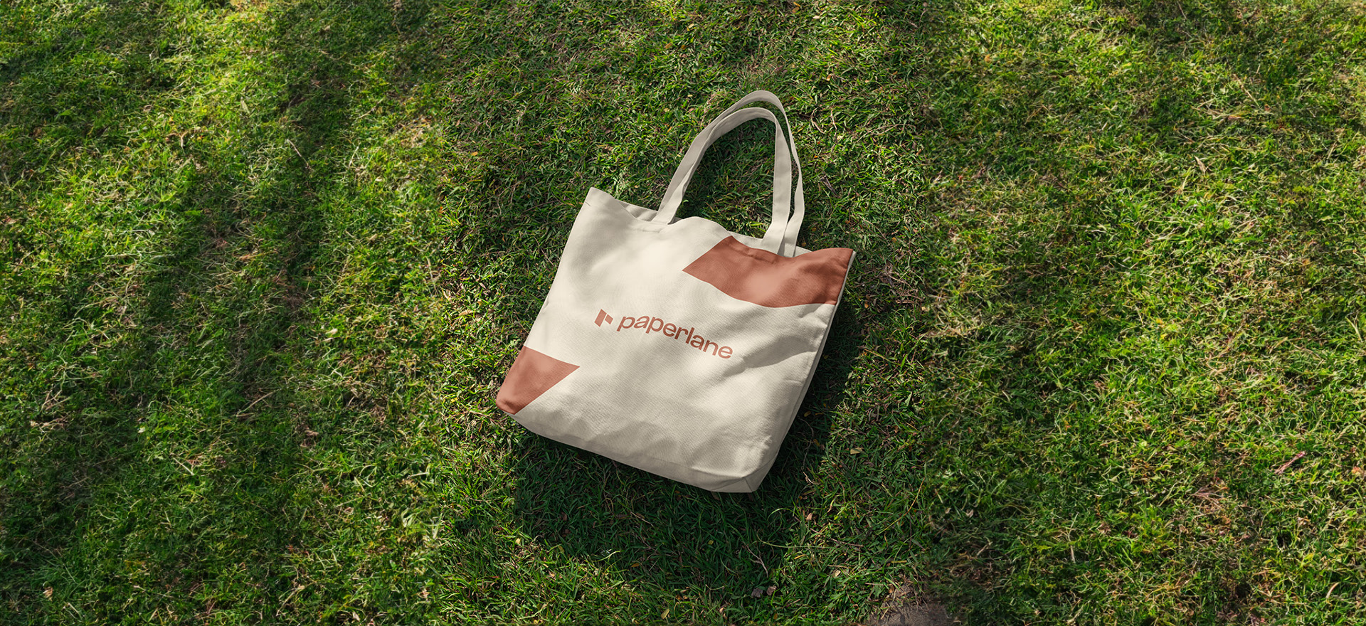
We started by designing a logo that combines a bold, modern "P" with two parallel lines. This subtle graphic gesture not only reinforces the name "Paperlane", but also evokes structure, direction, and consistency.
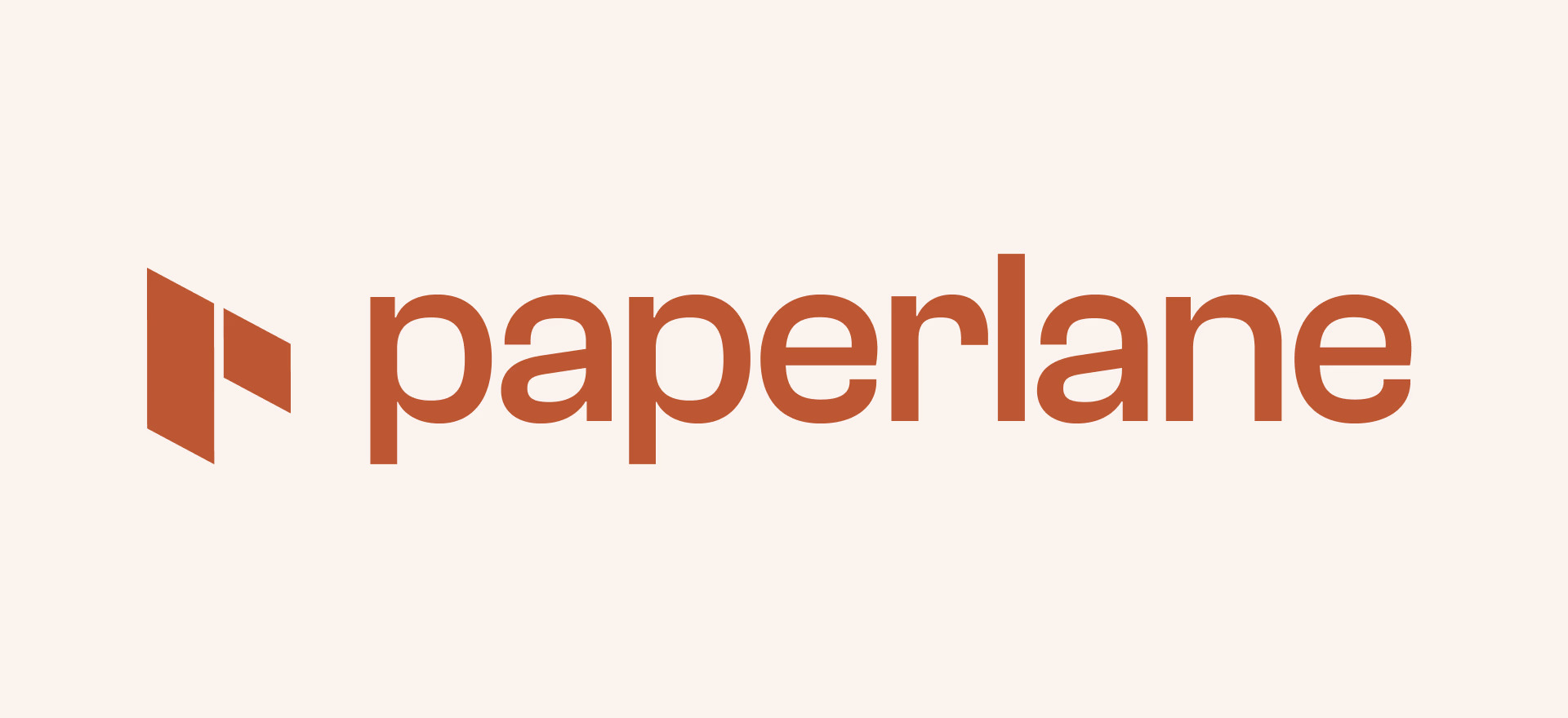
The mark works just as well on its own, a flag planted in the brand's warm terracotta, instantly recognizable at any size.

A palette of paper and ink
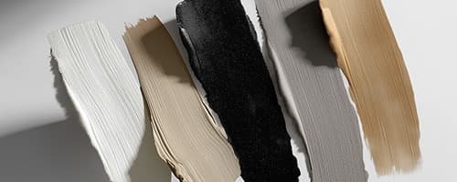
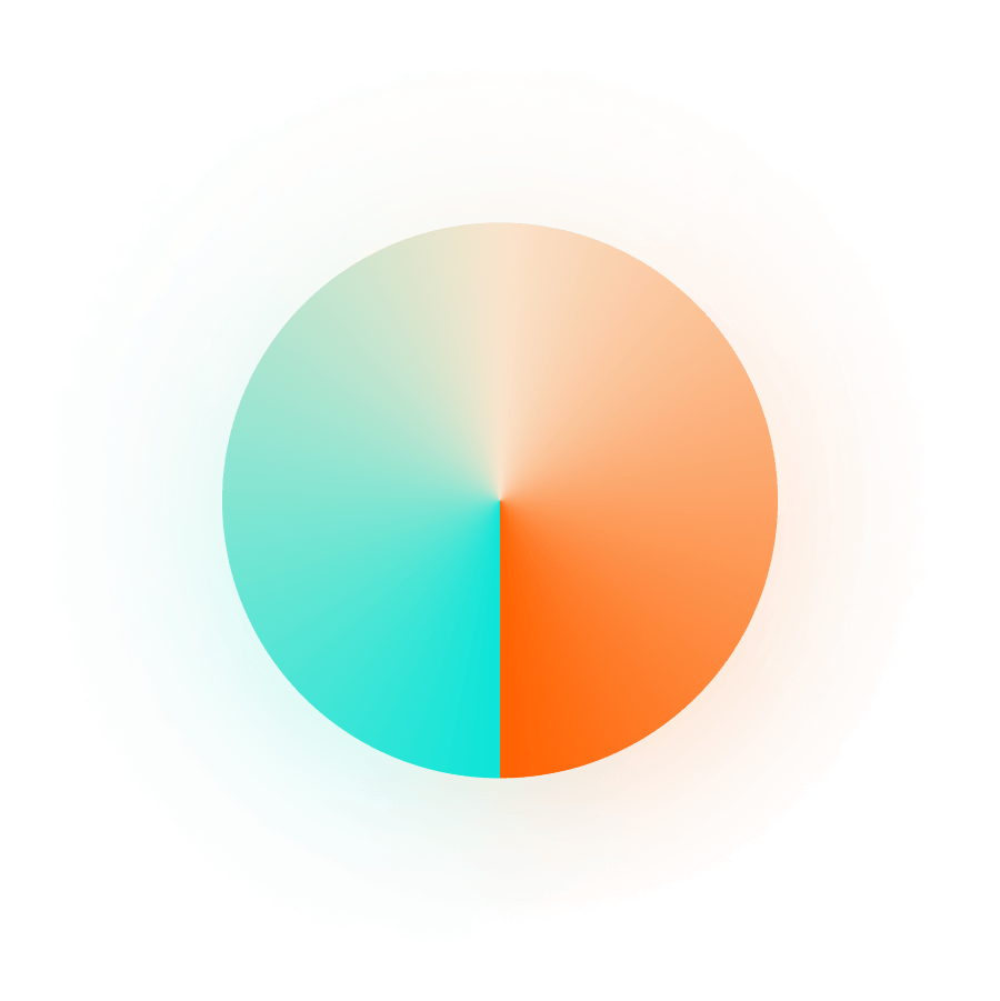
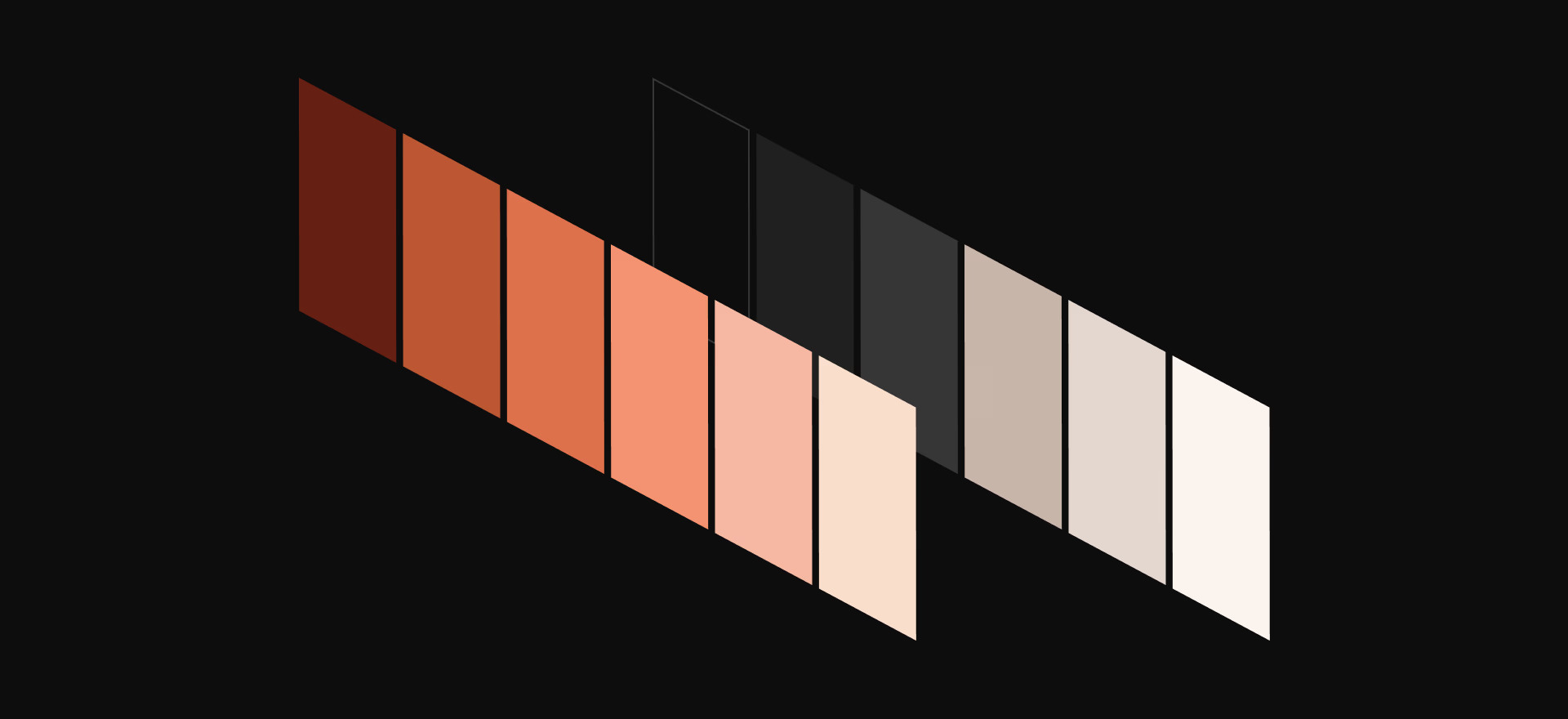
The colors come straight from the studio floor: terracotta inks fading into blush, paper whites warming into kraft tones. A palette that feels printed rather than displayed, echoing the material world Paperlane lives in.
Craft in application
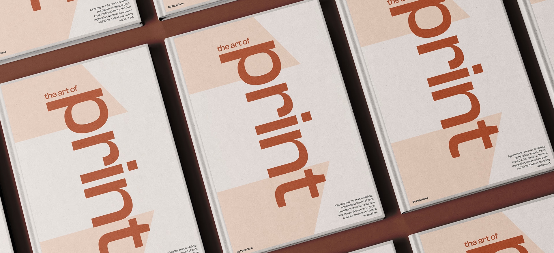
The system proves itself in print. Editorial pieces like "The Art of Print" put the typography and layout grid to work, showing clients what the studio is capable of on the exact medium it sells.
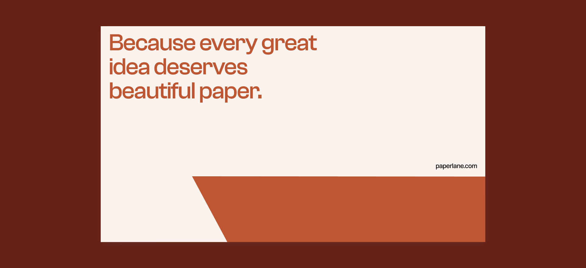
The brand voice completes the picture, with campaign lines that say the quiet part with confidence: because every great idea deserves beautiful paper.
The result is a clean and confident identity that elevates Paperlane's positioning and gives them the tools to communicate their standards across every touchpoint, from product packaging to digital assets.
Project Details
Client: Paperlane
Year: 2025
Type: Strategy, Branding