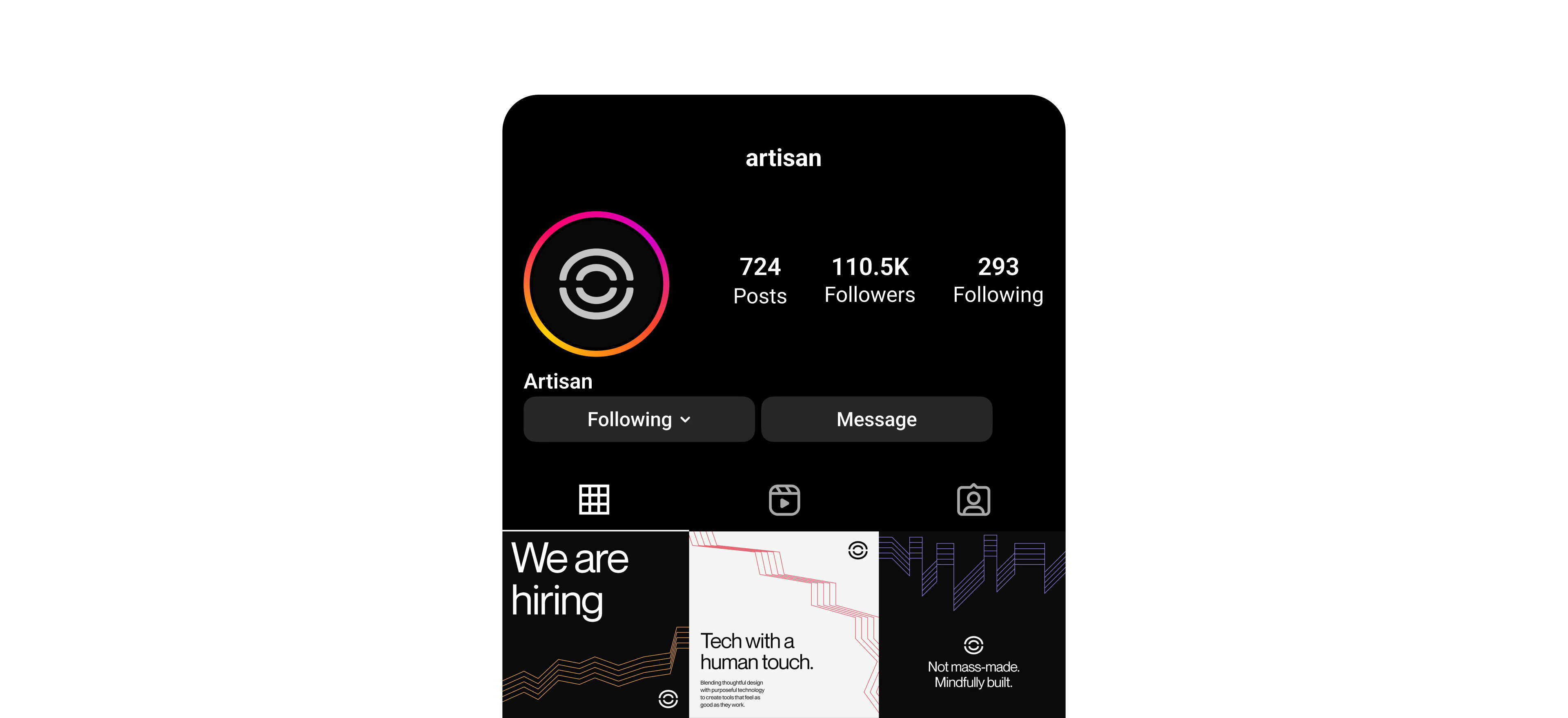
Artisan creates digital tools with the precision of a designer and the sensitivity of a craftsman. Their ambition is to build products that feel deliberate and enduring: experiences that are clear, balanced, and quietly powerful.
They came to us with a need for an identity that could express this philosophy. Something that captured their thoughtful process, their respect for detail, and their belief that good design takes time.
A brand rooted in layering
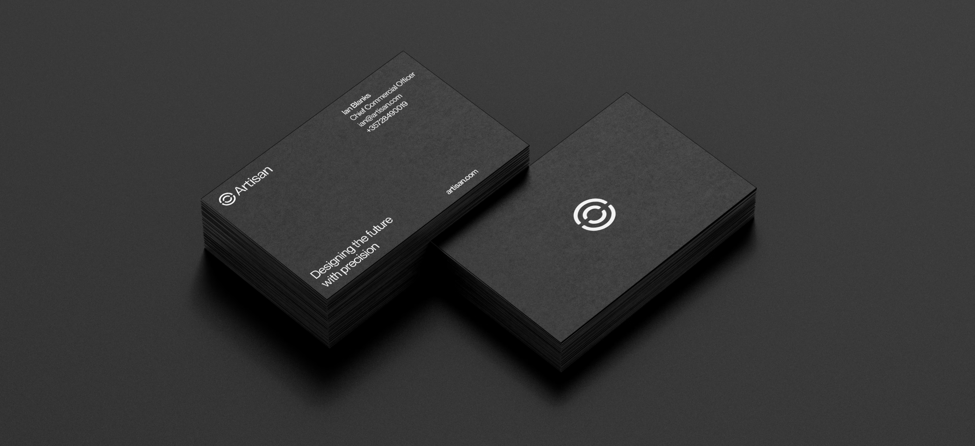
We developed a brand rooted in the idea of layering. The logo is formed from two overlapping shapes that suggest an imperfect circle, a nod to the iterative, human nature of creation. It speaks to how Artisan builds: not in rigid systems, but through refinement, exploration, and care.

A palette with depth
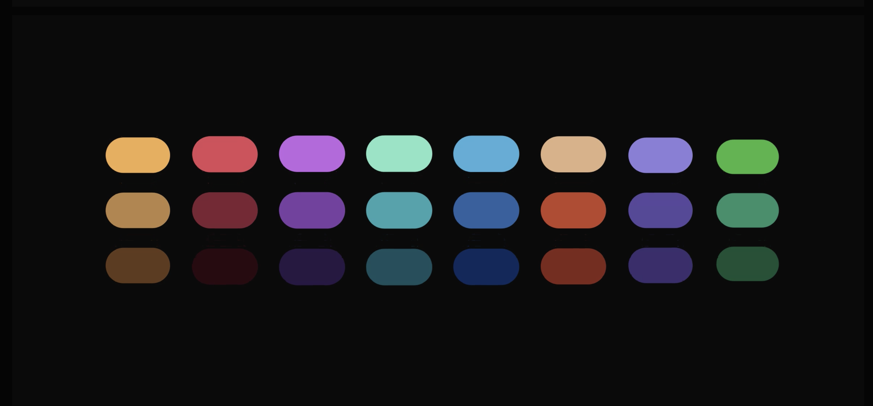
The concept of layering guided the whole system, starting with color. Each hue exists in three stacked depths, from bright to deep, so every composition can suggest dimension without ever getting noisy.
Lines that carry the message
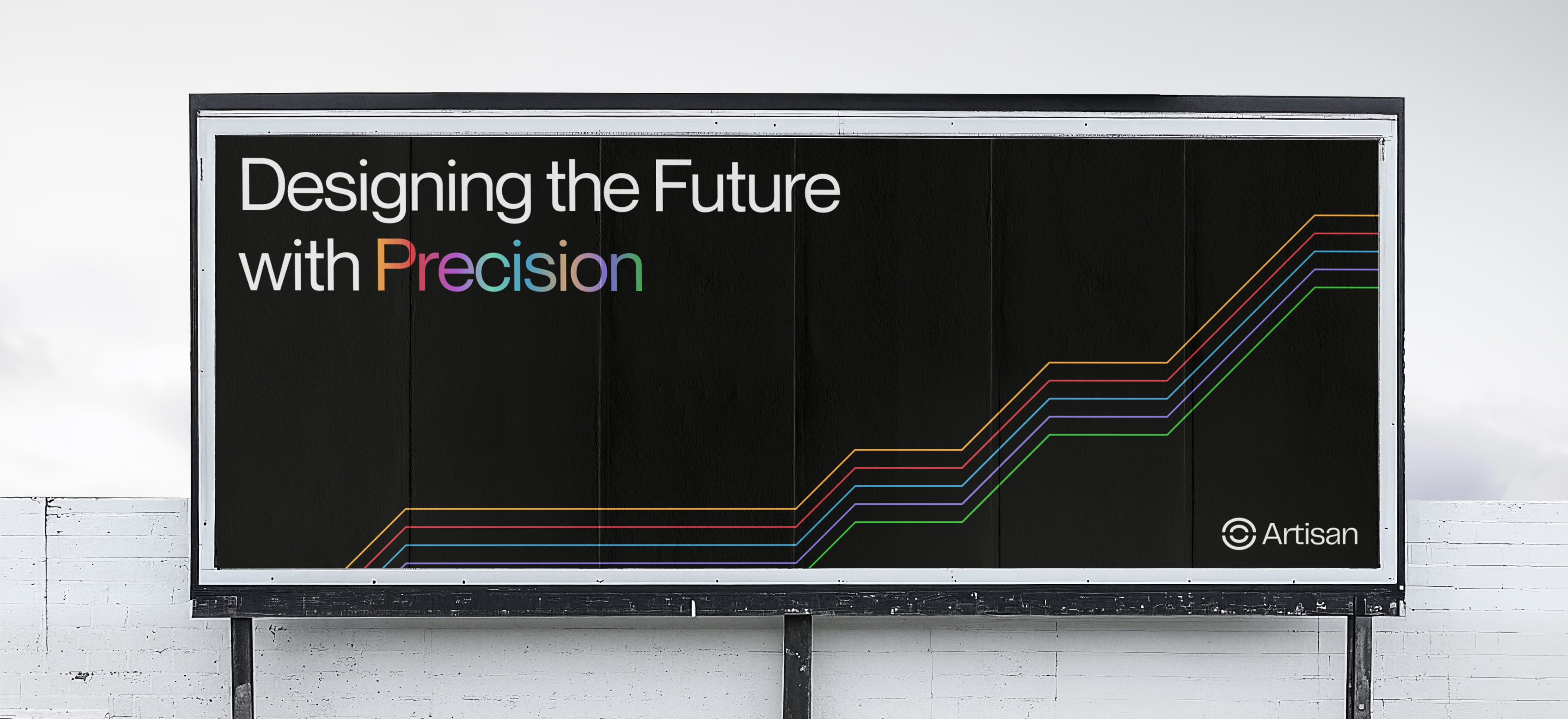
The layered line became the brand's signature gesture. On campaign materials it draws rising paths and vibrating contours, giving even a static billboard a sense of motion and build-up.
A system that flexes
From launch teasers to manifesto posts, the identity adapts to every format while staying instantly recognizable: the same mark, the same lines, a different rhythm each time.
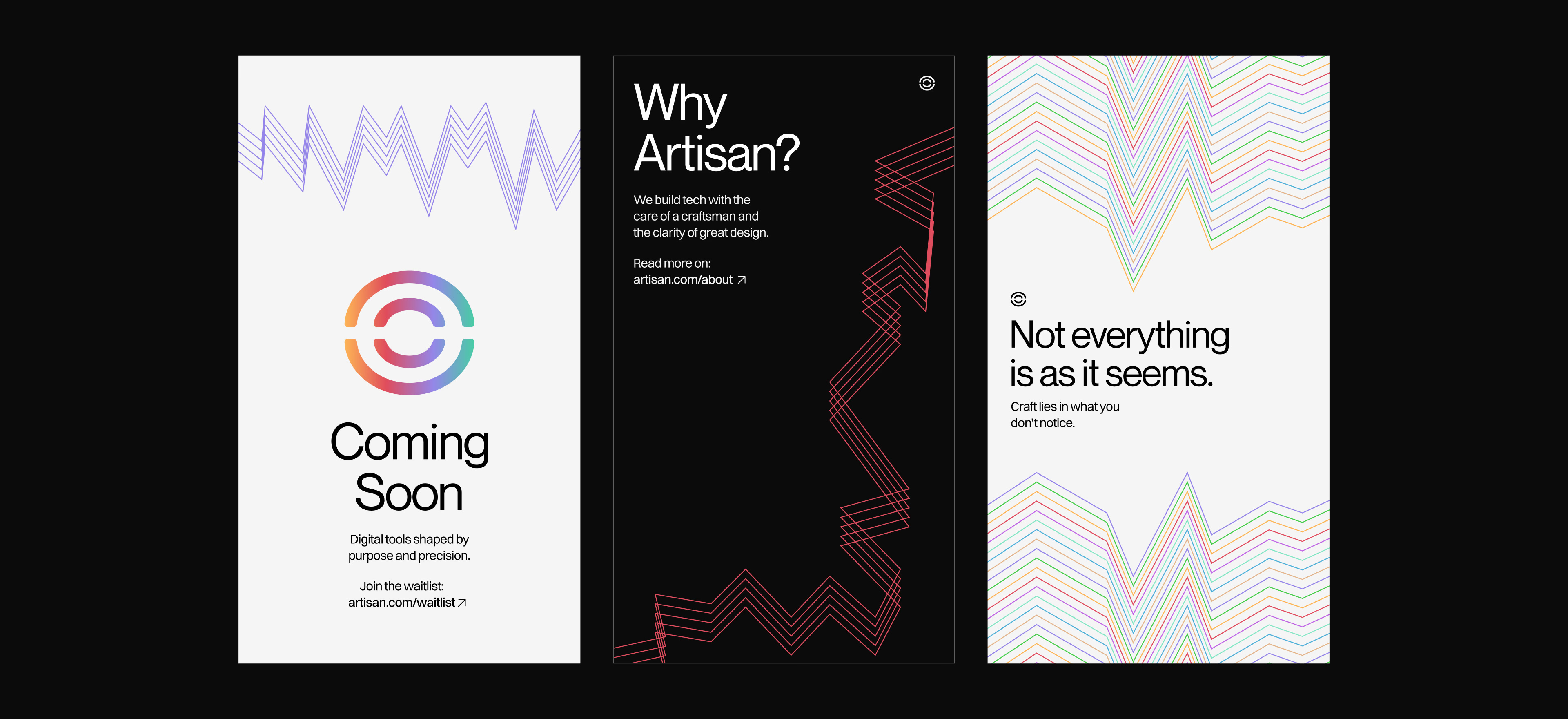
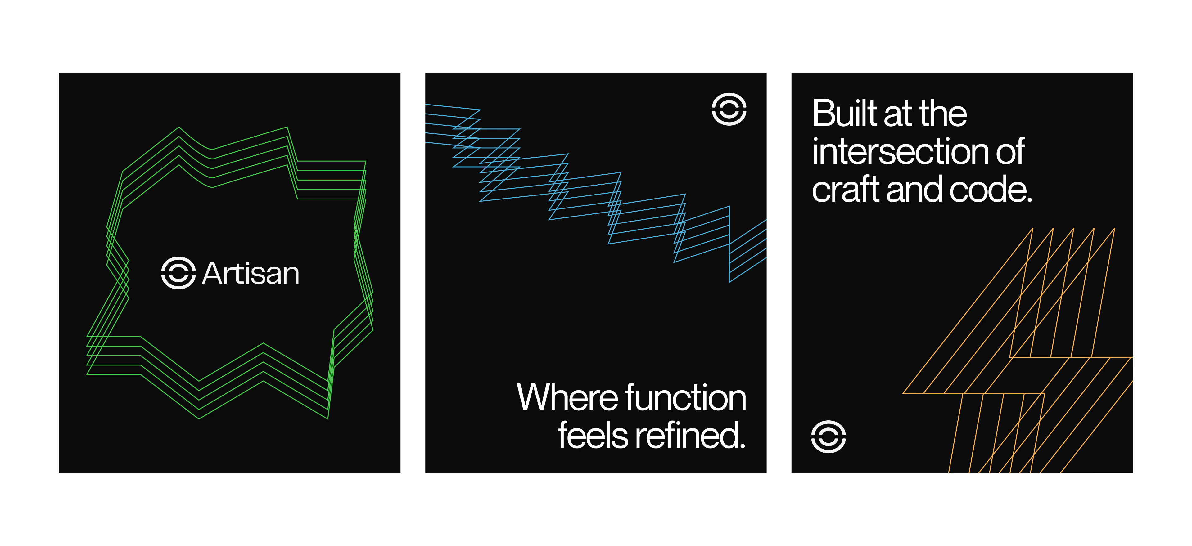
The result is a calm and confident brand system that mirrors Artisan's way of working: intentional, flexible, and built to last.
Project Details
Client: Artisan
Year: 2025
Type: Strategy, Branding, Motion